Standard development disclaimers apply. This is pre-pre-Alpha content, everything is subject to change, features may not be present in the final version, there's a very strong chance none of this will ever be released, etc. etc.
There shouldn't be any plot spoilers in these posts, but there will be occasional discussions related to characters, locations, mechanics, and other aspects of my potential upcoming Shadowrun campaign (tentatively titled "CalFree in Chains"). You may wish to skip them if you'd like to be completely surprised.
This was another weekend of cut-scene work. I think it’s the last significant one in the game… there are many more missions after this, but I think the major story beats from here on out are just done through dialogue or direct action. It was fairly time-consuming to get right, but not especially tricky. Unlike the first one, which had a lot of movement, the characters are mostly stationary for this one, but there’s a fair amount of synchronized action. But not TOO synchronized… it looks really fake if you have a whole bunch of characters performing an action in lockstep, so there are little micro-pauses scattered throughout to make it feel a little more realistic.
I’ve already talked about cut-scenes before, though, so this time around, let’s talk about image manipulation.
I am not an artist. At all. That’s a huge part of the reason why I shied away from game development after early youthful enthusiasm: I can’t draw, don’t have a very good artistic eye, and am generally helpless when it comes to visual things. Which, again, is a huge part of the reason why Shadowrun is such a tempting platform for me to create on, thanks to its amazing library of great-looking artwork.
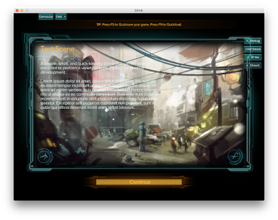
There are still a handful of images that I need to work with, though. A big example of this is loading screens. By default, if you don’t set a loading screen, you’ll see something like this when a scene loads.

Pretty gnarly, right? The image itself isn’t bad - it’s a nicely generic dystopia-plus-magic tableau that says “Shadowrun” - but it’s not very readable. In particular, the white text blends into the white pixels of the background image. What gives?
Well, this is the same default image that’s been around since the very first Shadowrun Return game in 2013. Back in that prehistoric era, they used to draw a translucent overlay on top of the loading image to provide nice contrast between the image and the text. With the shift to Dragonfall, HBS removed that overlay. This was a fine change on its own - it gives more flexibility in how you compose the image, keeps it from appearing needlessly dark - but the default image was never updated, so it’s no longer an acceptable fallback.
So, we need to produce our own image. We can provide any 1024x1024 PNG, but adding a random image will look janky within the game, with an abrupt transition to the black border and potentially the same white-on-white contrast problem.
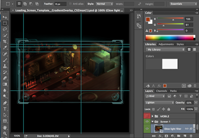
Fortunately, people with more talent than I have come up with good tools to produce your own loading screens that look good, match the general feel of the official campaigns, and solve the text problem. The one I’m currently using is an update of the CXZman template, a Photoshop layered PSD with smart objects that ingests an image and outputs a nicely framed version of that image.

As a sidebar, this is the only time I use Photoshop. I’m much more familiar and comfortable with GIMP, and tend to prefer that for any image-related floundering. But this particular template really does require proper Photoshop to work.
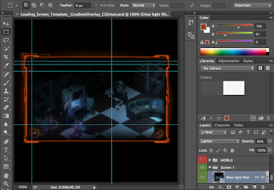
I’ve used versions of this template before for Antumbra Saga and The Caldecott Caper, so I’m already somewhat familiar with it. At the same time, I kind of wanted to mix things up a little. In particular, that teal-ish blue border feels really dated to me. The official Hong Kong campaign has a really nice gradient border. I can’t do that, but it’s pretty simply to just replace one color with another, so I arbitrarily decided that CFiC would use an orange border instead.

You can put any image that you want within this. I’ve been following the convention of the HBS campaigns and my own prior games to populate these with in-engine screenshots of the current scenes. I like this, since the in-game artwork looks really nice, and it’s fairly simple to capture (you can just use the Steam screenshot button or a similar utility). I’ll build and run the scene without any other characters in it, then just move my player around to various areas to life the fog-of-war and capture a screenshot. This time around, I captured these in 1920x1080 resolution, which gave a lot of buffer for the roughly 900x520 visible space within the frame.
The image actually needs to be placed twice. First, double-click the “Actual artwork” smart object. Hide any existing art by clicking the eyeball icon in the lower-right. Then drag the screenshot PNG in.

In my previous games, I always just accepted the centered version of the image. This time, I was a little more opinionated, and would pan the image to what I thought was the best-looking position. Brighter colors tend to look nicer; keep in mind that a translucent overlay will cover the left half of the image, so that area may look particularly dark anyways. I try to avoid including any UI elements, most notably the PDA/power button in the upper left.
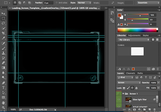
Once I’m happy with how it looks, I save the smart object (“placing” the new image within it) and return to the template. Next, I need to repeat this process in the “Glow light filter” smart object. If you forget this step, it will light the new image with glow colors from the previous image, which isn’t too noticeable on some pictures but can be very jarring on others. This process was a bit more complicated this time around, since I would need to position the pasted image at the exact same offset as in the “Actual artwork”.

After that’s done, the image is ready! The template automatically handles cropping and overlays and the gradient and glow and everything. You can then export it as a 1024x1024 image. This goes into the art/loadingimages folder of your content pack, after which it will appear as an optional loading screen within the editor and, eventually, within the game.
Much nicer!
Custom loading screens definitely aren’t necessary, and don’t have any direct impact on the game’s functions, but I think they’re one of the critical factors in making a campaign feel polished. These are some of the first images a player will see when starting a campaign, and they may be looking at them for quite a long time thanks to the long load times! So taking a little extra time to make sure they look good is, in my opinion, time well spent.

No comments:
Post a Comment